Silly Stuff
My favourite thing about the old web was the random creative things people had on their websites for other people to download/interact with. So I wanted to make sure I paid tribute to that with this page.
Pixel Groups
I like these little communities where you decorate a cute pixel image and then collect a whole garden of them from other folks who have decorated their own. I am only a member of one so far but I hope to add more and spruce this section up a little!
Compact Crayons
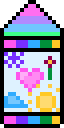
Compact crayons originated here! Feel free to download my crayon for your collection -
Other folk's crayons
Code Snippets
Below are some copy-pasteable pieces of code for beginners to use to add a bit of sillyness to their site.
Let users customize the text colour of your site
To see this in action check out my customize page 😄.
Step one: You can show a colour picker with this code:
<form id="colour-picker-form">
    <input type="color" id="color-picker" class="color-picker">
</form>
Step two: Add this JavaScript to your site to respond to colour changes:
  document.addEventListener("DOMContentLoaded", function() {
      var colorPicker = document.getElementById("color-picker");
      var root = document.querySelector(':root');
      if (colorPicker) {
        colorPicker.value = localStorage.getItem("custom-color") || window.getComputedStyle(root).getPropertyValue('--custom-color');
        colorPicker.addEventListener("change", function (event) {
            root.style.setProperty('--custom-color', event.target.value);
            localStorage.setItem("custom-color", event.target.value);
        });
      }
  });
Step three: In CSS for the elements you want to have custom colour applied, use var(--custom-color). Example with the body text below.
html {
      --custom-color: #000; /* this is the default value if the user doesn't select anything */
}
body {
      color: var(--custom-color);
}
Cute custom checkboxes on your website forms
Below is an example.
Step one: Where you want your checkboxes to be, set up the form element
<form>
  <label>
    <input name="checkItems" type="checkbox" />
    <span class="checkbox-ghost"></span>
    Item one
  </label>
  <label>
    <input name="checkItems" type="checkbox" />
    <span class="checkbox-ghost"></span>
    Item two
  </label>
  <label>
    <input name="checkItems" type="checkbox" />
    <span class="checkbox-ghost"></span>
    Item three
  </label>
</form>
Step two: In CSS set up the styles to make it happen!
@keyframes rightToLeftX {
0% {
  background: linear-gradient(0deg, rgba(73, 62, 255,1) 0%, transparent 0%);
}

5% {
  background: linear-gradient(0deg, rgba(73, 62, 255,1) 5%, transparent 5%);
}

10% {
  background: linear-gradient(0deg, rgba(73, 62, 255,1) 10%, transparent 10%);
}

15% {
  background: linear-gradient(0deg, rgba(73, 62, 255,1) 15%, transparent 15%);
}

20% {
background: linear-gradient(0deg, rgba(73, 62, 255,1) 20%, transparent 20%);
}

25% {
background: linear-gradient(0deg, rgba(73, 62, 255,1) 25%, transparent 25%);
}

30% {
background: linear-gradient(0deg, rgba(73, 62, 255,1) 30%, transparent 30%);
}

35% {
background: linear-gradient(0deg, rgba(73, 62, 255,1) 35%, transparent 35%);
}

40% {
background: linear-gradient(0deg, rgba(73, 62, 255,1) 40%, transparent 40%);
}

45% {
background: linear-gradient(0deg, rgba(73, 62, 255,1) 45%, transparent 45%);
}

50% {
background: linear-gradient(0deg, rgba(73, 62, 255,1) 50%, transparent 50%);
}

55% {
background: linear-gradient(0deg, rgba(73, 62, 255,1) 55%, transparent 55%);
}

60% {
background: linear-gradient(0deg, rgba(73, 62, 255,1) 60%, transparent 60%);
}

65% {
background: linear-gradient(0deg, rgba(73, 62, 255,1) 65%, transparent 65%);
}

70% {
background: linear-gradient(0deg, rgba(73, 62, 255,1) 70%, transparent 70%);
}

75% {
background: linear-gradient(0deg, rgba(73, 62, 255,1) 75%, transparent 75%);
}

80% {
background: linear-gradient(0deg, rgba(73, 62, 255,1) 80%, transparent 80%);
}

85% {
background: linear-gradient(0deg, rgba(73, 62, 255,1) 85%, transparent 85%);
}

90% {
background: linear-gradient(0deg, rgba(73, 62, 255,1) 90%, transparent 90%);
}

95% {
background: linear-gradient(0deg, rgba(73, 62, 255,1) 95%, transparent 95%);
}

100% {
background: linear-gradient(0deg, rgba(73, 62, 255,1) 100%, transparent 100%);
}
}

@keyframes leftToRightX {
0% {
background: linear-gradient(180deg, rgba(73, 62, 255,1) 0%, transparent 0%);
}

5% {
background: linear-gradient(180deg, rgba(73, 62, 255,1) 5%, transparent 5%);
}

10% {
background: linear-gradient(180deg, rgba(73, 62, 255,1) 10%, transparent 10%);
}

15% {
background: linear-gradient(180deg, rgba(73, 62, 255,1) 15%, transparent 15%);
}

20% {
background: linear-gradient(180deg, rgba(73, 62, 255,1) 20%, transparent 20%);
}

25% {
background: linear-gradient(180deg, rgba(73, 62, 255,1) 25%, transparent 25%);
}

30% {
background: linear-gradient(180deg, rgba(73, 62, 255,1) 30%, transparent 30%);
}

35% {
background: linear-gradient(180deg, rgba(73, 62, 255,1) 35%, transparent 35%);
}

40% {
background: linear-gradient(180deg, rgba(73, 62, 255,1) 40%, transparent 40%);
}

45% {
background: linear-gradient(180deg, rgba(73, 62, 255,1) 45%, transparent 45%);
}

50% {
background: linear-gradient(180deg, rgba(73, 62, 255,1) 50%, transparent 50%);
}

55% {
background: linear-gradient(180deg, rgba(73, 62, 255,1) 55%, transparent 55%);
}

60% {
background: linear-gradient(180deg, rgba(73, 62, 255,1) 60%, transparent 60%);
}

65% {
background: linear-gradient(180deg, rgba(73, 62, 255,1) 65%, transparent 65%);
}

70% {
background: linear-gradient(180deg, rgba(73, 62, 255,1) 70%, transparent 70%);
}

75% {
background: linear-gradient(180deg, rgba(73, 62, 255,1) 75%, transparent 75%);
}

80% {
background: linear-gradient(180deg, rgba(73, 62, 255,1) 80%, transparent 80%);
}

85% {
background: linear-gradient(180deg, rgba(73, 62, 255,1) 85%, transparent 85%);
}

90% {
background: linear-gradient(180deg, rgba(73, 62, 255,1) 90%, transparent 90%);
}

95% {
background: linear-gradient(180deg, rgba(73, 62, 255,1) 95%, transparent 95%);
}

100% {
background: linear-gradient(180deg, rgba(73, 62, 255,1) 100%, transparent 100%);
}
}

input[type="checkbox"] {
    position: absolute;
    opacity: 0;
}

.checkbox-ghost {
    position: relative;
    display: block;
    width: 15px;
    height: 15px;
    border-radius: 5px;
    border: 3px solid rgba(73, 62, 255,1);
    margin-right: 10px;
    transition: all 200ms ease-in;
}

input[type="checkbox"]:checked + .checkbox-ghost::before {
    animation: leftToRightX 100ms linear forwards;
    transform: rotate(-45deg);
    display: block;
    content: "";
    position: absolute;
    top: 0;
    left: 0;
    width: 3px;
    border-radius: 4px;
    height: 15px;
    margin-left: 6px;
}

input[type="checkbox"]:checked + .checkbox-ghost::after {
    animation: rightToLeftX 100ms linear forwards;
    animation-delay: 100ms;
    transform: rotate(45deg);
    display: block;
    content: "";
    position: absolute;
    top: 0;
    left: 0;
    width: 3px;
    border-radius: 4px;
    height: 15px;
    margin-left: 6px;
}
Little tooltips on your links
You can try this out by Hovering on this and Hovering on this.
Step one: Any time you want your link to have a tooltip, set it by adding data-text to it, like this:
<a href="https://google.com" data-text="Visit google">This is a link</a>Step two: In your CSS, use this code:
@keyframes tooltip {
      0% {
              transform: scale(0) translateY(-110%);
              opacity: 0;
            }

            100% {
                    transform: scale(1) translateY(-110%);
                    opacity: 1;
                }
}


a[data-text] {
    position: relative;
  }

  a[data-text]:hover::after {
        animation: tooltip 100ms ease-in forwards;
        transform: translateY(-110%);
        position: absolute;
        content: attr(data-text);
        background: rgba(185, 48, 123, 0.9);
        top: 0;
        left: 0;
        right: 0;
        width: fit-content;
        margin: auto;
          color: white;
          padding: 2px 4px;
          border-radius: 2px;
          font-size: .7em;
  }
Rainbow text
Try out some rainbow text! Everything you type will be rainbowy! This could be especially fun for rainbow links!
Step one: wrap rainbow text in a span with a class of rainbow-text
<span class="rainbow-text">this text will be rainbow</span>Step two: In your CSS, use this code:
.rainbow-text {
    background-image: linear-gradient(to right, #6e436b 0%, #6e436b 16.6%, #4295b6 16.6%, #4295b6 33.2%, #469a46 33.2%, #469a46 49.8%, #d8c91d 49.8%, #d8c91d 66.4%, #cc7905 66.4%, #cc7905 83%, #FF6663 83%, #FF6663 100%);
      background-size: 30%;
      background-repeat: repeat;
      -webkit-background-clip: text;
        background-clip: text;
        color: transparent;
  }
Bouncy text
You can check out a few examples: Bouncy
... and you can easily have lots of bouncy text.
Step one: wrap bouncy text in a span with a class of bouncy-text
<span class="bouncy-text">this text will be bouncy</span>Step two: add this javascript to your site:
document.addEventListener("DOMContentLoaded", function() {
    var bouncy = document.getElementsByClassName("bouncy-text");
    Array.from(bouncy || []).forEach(function (text) {
        var textArray = text.textContent.trim().split("");
        text.innerHTML = "";
        textArray.forEach(function (letter, index) {


              var span = document.createElement("span");
              span.style['animation-delay'] = (100 * index) + 'ms';
              span.textContent = letter.replace(" ",'\xa0');

              // Optional: The next few lines can be deleted if you don't want randomly generated colors
              const r = parseInt(Math.random() * 255);
              const g = parseInt(Math.random() * 255);
                const b = parseInt(Math.random() * 255);
                span.style.color = "rgb(" + r + "," + g + "," + b + ")";


                  // Keep this line though
                  text.appendChild(span);
              });
            });
});
Step three: In your CSS, use this code:
@keyframes letter-animation {
  0% {
    transform: rotate(-10deg) translateY(-15px) scale(1);
    opacity: 1;
  }

  5% {
    transform: rotate(-10deg) translateY(-25px) scale(1.2);
  }

  12% {
    transform: rotate(0deg) translateY(0) scale(1);
    opacity: 1;
  }


  100% {
      transform: rotate(0deg) translateY(0) scale(1);
      opacity: 1;
  }

}

.bouncy-text > span {
  display: inline-block;
  animation-name: letter-animation;
  animation-duration: 2s;
  animation-timing-function: ease-in;
  animation-fill-mode: forwards;
  transform: rotate(-10deg) translateY(-20px);
  animation-iteration-count: infinite;
  opacity: 0;
  font-weight: bold;
  letter-spacing: 2px;
  color: var(--link-underline-color);
}
Headings that light up as they scroll into view
You can see this on my about me page or look at this longer example.
The code here is a starting point; you can use CSS to style the headings any way you like as they scroll into view!
Step one: Any heading you want to change when it scrolls into view, give a class of "light-up". Example below!
<h2 class="light-up">This heading will light up</h2>Step two: add this javascript to your site:
document.addEventListener("DOMContentLoaded", function () {
  var lightupHeadings = Array.from(document.getElementsByClassName("light-up"));

  if (lightupHeadings.length) {
      window.addEventListener("scroll", () => {
          lightupHeadings.find(function (element) {
          box = element.getBoundingClientRect();

          /* You can change the values here to numbers that make sense to you.
          If you find they are changing too soon or too late for your taste,
          try adjusting the 0 and 100! */
          if(box.top >= 0 && box.top <= 100) {
              requestAnimationFrame(() => {
                  lightupHeadings.forEach(function (element) {
                      element.classList.remove("visible");
                  });

                  element.classList.add("visible");
              });

              return true;
          }

          return false;
      });
    });
  }
});
Step three: In your CSS, style the headings however you like. Here's the CSS I used on my example page. When the heading is visible it will have a visible class, so use that to style the "light up" version.
.light-up {
  color: rgba(0,0,0,1);
  transition: transform 200ms ease-out, color 200ms ease-in-out;
}

.light-up.visible {
  color: rgba(0,0,0,0);
  background-image: linear-gradient(90deg, rgba(255,86,238,1) 0%, rgba(9,9,121,1) 25%, rgba(0,212,255,1) 49%, rgba(124,209,143,1) 69%, rgba(255,207,0,1) 88%);
  background-clip: text;
  background-size: 50%;
  background-repeat: repeat;
  outline: none;
}
Rainbow glow behind text
This is similar to the rainbow text, but having it as a background glow instead, with a subtle animation.
Step one: set up your HTML. `data-text` attribute needs to match what is in the elememt
<span class="rainbow-glow" data-text="Rainbow Glow">Rainbow Glow</div>Step two: Set up your CSS
@keyframes glow-in {
  0% {
    transform: scale(1);
    opacity: .5;
  }

  50% {
    transform: scale(1.02);
    opacity: 1;
  }

  60% {
    transform: scale(1.02);
    opacity: 1;
  }


  100% {
    transform: scale(1);
    opacity: .5;
  }
}

.rainbow-glow {
  position: relative;
  font-weight: bold;
  font-size: 40px;
  text-shadow: 2px 2px 3px rgba(255,255,255,.8);
}

.rainbow-glow::after {
  animation: glow-in 3s linear infinite;
  position: absolute;
  left: 0;
  top: 0;
  z-index: -1;
  content: attr(data-text);
  background: linear-gradient(90deg, rgba(255,86,238,1) 0%, rgba(9,9,121,1) 25%, rgba(0,212,255,1) 49%, rgba(124,209,143,1) 69%, rgba(255,207,0,1) 88%);
  background-size: 30%;
  background-repeat: repeat;
  background-clip: text;
  color: transparent;
  filter: blur(.1em);
  text-shadow: none;
}